Sunday 31 December 2017

pp: researching hanbury attendees - study task


Nobrow: Nobrow is a book publishing company that began in 2008. They produce a range of print including children’s books, comics and their own magazine. You are able to submit your children’s book story ideas to them, which is one of the reasons why I am very interested in this company. Flying Eye Books is the sub-genre of the Nobrow publishing house that specialises in children’s illustration, which is what I would focus on. FEB began in 2013 and they have a wide selection of children’s books ranging from simple picture books to non-fiction factual picture books. As someone who is interested in creating children’s books this is a company I would be very happy to talk to.

Anorak: Anorak is a specialised children’s book publishing company who produce two magazines, one who’s demographic is mostly 6-12 year olds and DOT which is aimed for pre-schoolers. They are a company in which I would be very interested in as someone who wants to branch out her children’s illustration, which does not always have to be narrative based. Therefore, submitting to this magazine would be perfect for someone like me to test out which illustration. They also publish colouring and activity books.

The Dots: The Dots is a network of creatives which you can sign up to and upload your work, ideas, find jobs, connect with people etc. It’s a way to make connections easily and network myself. It also gives me a chance to look at what other creatives are doing and gather inspiration and knowledge. It’s a good way for me to expand my illustration knowledge and find colleagues. As someone who is scared of the idea of being thrown into the deep end without knowing what to do, the Dots is a good chance for me to find my feet before that happens.
Wednesday 20 December 2017

pp: changing my identity on instagram

for the past 4/5 years i have been '@scribbleblog' on most of my social medias. it's a name that i created, even though i wasn't a blog, so i'm not really sure where that bit came from. but i feel like the name has been my comfort for a while, i've been afraid to change it because i've been known as that for so long. however, i decided it was time for a change. 

it's time to be @elizabethillustration. it sounds more professional, and it has my name in it so people will know more the person behind the handle. 

the rebrand instagram post


Thursday 23 November 2017

pp: research - linzie hunter


Linzie Hunter is an illustrator who currently lives in South London. She specialises in typography and children's illustration. Her work is very inspiring to me as someone who is really interested in both of these fields. Her work is fun and colourful. Although she does not write children's books herself, she has illustrated one (which is how i found her!) called 'If You Had A Jetpack'. Her illustrations are adorable and whimsical, from this book most of them different types of animals. I am especially interested in the way that she utilises coloured pencil and digital works, as someone who really loves the coloured pencil medium.

She unfortunately does not take student emails as she is too busy.

Wednesday 22 November 2017

pp: my identity

I have been known as @scribbleblog for so long i don't even know who i am anymore. i want a change, but what to?

i don't like the name Bethany, i think the capital letter B is really ugly (don't really have a reason for that, just personal preference) and i in general just don't really like my name. 

i have this joke that i play on people sometimes when they ask what 'beth' is short for, and i like to tell them it's Elizabeth. i don't know what it is about that name but it just feels more professional and fancy, like i'm an actual adult. 

because i've been known to do this joke so often and got so attached to the name i think i am going to change my identity as a professional to Elizabeth Faye. (Faye is my middle name)

i really love this name and think that it's the beginning of me finally become a professional illustrator.

Wednesday 18 October 2017

pp: self portrait #1


here is my first self portrait. i wanted to play on the idea of doing a self portrait without using my actual face or identifiers of my face, so i decided to go with what i sometimes call myself 'egg-head'. this is mostly because i think that i have a really egg shaped head, my forehead doesn't have any shape or widow's peak, and my skin is deathly pale, so yep, that's an egg.

i think it's really cute, and i decided to try out using more digital means, utilising my new gouache brushes from Kyle Webster which i really love. it's a little bit of a different style for me but i still like it.

Tuesday 10 October 2017

pp: thought bubble festival


 i helped out at thought bubble festival in september 2018! i know it was last month but i wanted to talk about it because it was such a fun and new experience. it was really fun to experience what it is like to sell my work and talk to people about my work, and see how many people actually bought it! so many people might have my posters on their wall now! it's a really good feeling and something that
i'd really love to do in the future. it also taught me about handling money from customers and making sure they were given the right change. from the day that i sat behind the booth, i got a sense of what people tended to buy more and the posters & smaller items like stickers and buttons sold a lot more than the bigger more expensive items so i should keep this in mind if i was to do something like this again in the future.

Friday 5 May 2017

SB1: lo siento studio

Lo Siento Studio is a graphic design studio specializing in Identity, Packaging & editorial directed by Borja Martínez. I found them because I am interested in how character illustration can be placed upon packaging and came across their proposed 'churro' packaging range. I am really in love with this packaging and think that it is something that inspires me to want to do the same.
The simple use of colours and cute characters is inviting so this is what makes it such a successful packaging.


It's not even just packaging that they are trying to create with this brand, but also merchandise that can come out of it due to it's character and playful nature. I think this is why using character in packaging can be so successful because it makes it endearing and a collectable so that people want to buy more.

Thursday 4 May 2017

SB1: samuel youn

samuel youn is a 2D concept artist who I discovered recently. I was drawn in by his beautiful digital portraits. there's something about his style which is a mix of digital and realistic that is so interesting to me. as a budding digital artist it is something that i aspire to have the skills to make in the future.


the amount of personality and character that you get just from a simple headshot is really something special about his work. Using different facial features, expressions and poses he creates these personalities. For example, the first one seems sophisticated and aloof, looking away from you seemingly disinterested in you. Whereas the bottom one seems distracted, she's looking at you straight on but her eyes are somewhere else.

I really love this nature of his work.

Thursday 20 April 2017

SB1: appeal


I have talked about this video a lot on my Studio Practice blog and how much it helped with the development of my 505 module. The video talks about the use of exaggeration in your characters to create more appeal to the viewers. I gained a lot of knowledge from this video as someone who always used to draw the same characters. Although this is an Animation principle, I think it still relates to anyone who wants to do character design. For me, I would like to do character design FOR animation so it's really helpful. When I watched this video it gave me a new outlook on how to look at my characters and how I can change them to make them more interesting. YouTube has been a really interesting way for me to find inspiration and techniques in Character Designing which I am really interested in.

Monday 17 April 2017

SB1: scott watanabe's blog

After looking at Scott Watanabe again for a recent project in Illustration 2, I have discovered a different blog of his where he goes into more detail about his work and what it was like working for Disney.


I even found the post where he mentions that he has moved to Burbank to study at Disney as a trainee!


Reading his blog has been really interesting. Especially in the times before he was working at Disney, or his time as a trainee. It feels more like I'm reading something coming from someone my own age and I can relate to more. It's interesting to see how he talks and how much his artwork has grown since working for Disney.

I hope that in the future I can have a blog like this where I eventually get to say that I'm going on to do bigger and better things! It's really interesting for someone like me who is a fan of his work to read a more informal insight into his work.

Saturday 15 April 2017

creative report: what I think

So I decided to make a little post with some thoughts on this brief and what I think has been really interesting or helpful. As someone who doesn't have a lot of confidence and suffers from quite severe anxiety, at first the prospect of emailing someone was terrifying. I do not do well with talking to strangers or the changing of situations. I like being comfortable. 

So at first, of course, I was mortified when I heard the briefing. Having to email a real person?!?! What if I just annoyed them? What if they told me to bugger off?! What if it made me not want to be an illustrator anymore?! Of course these sorts of questions are just things my brain likes to come up with as some sort of coping mechanism and preparation for the worst.

However, I have to say that this brief has been really eye-opening for me. In the end I decided to email someone that I had been following as an illustrator for a while, this is because I am quite acquainted with her work and comfortable at the thought of talking to her as she is similar in age and seems down to earth. When I got her first response it was a really exciting time for me. She got back to me fairly quickly and seemed really lovely. It made me feel not as scared to ask her more questions.

After this experience with Helena, I think that in the future I would be more comfortable with emailing more practitioners that I admire, as I know now that it is actually quite humbling for them to be emailed by a 'fan' and want to help them.

Wednesday 12 April 2017

creative report: helena's response

So I got a response from Helena for the questions that I sent her!

Hi Bethany!

Apologies this is a few days late! I got busy over the weekend, but here we are:

2. What is it like being an independent illustrator?
It is difficult. You have to really want it, be dedicated, and be self motivated. You might start out like me (and probably a few others) working to live in a numb job, and having to fit illustration in around it. Working long after your shift and days off on your practice. You have to be savvy, and unashamed to push your work on every platform. To hashtag the hell out of it. You have to dream big and reach out and deal with knock backs (and no replies). Some days you’ll hate your work (everything you’ve done) and you’ll compare yourself. Somedays you’ll wish it was a steadier job. The independent part is incredible and it’s terrifying. You pick what work to take and when you do it and how you do it- but it wont come to you, you have to make everything happen. And you have to want it all enough to make it happen. I haven’t got their yet, I’m still learning a lot and my work is developing A LOT and I’m sure that once I’ve found my feet it wont seem quite so tough. Despite everything I’m so incredibly happy to do it and wouldn’t be satisfied doing anything else.

3. How hard was it to step into the industry coming out of university? Did you have any difficulties?

I think when you leave you have to hit the ground running. (I didn’t do that, however). I could have put in more effort on more days, and got to where I am faster (and maybe beyond!) I left uni and worked on my illustration around a full time job- in hindsight I wished I’d have worked less hours, and given more to my illustration. Maybe it’s part of the leaving-uni-pressure-for-immediate-success talking (that cripples all grads) but I think that when you graduate it’s important to just go full force into your practice!

4. I sometimes struggle trying to figure out where I sit (my work) in the industry, did you have that struggle? And if so how did you persevere?

*unanswered*

5. What do you most enjoy to work on as an illustrator?
I’m making a book at the moment, that’s very personal and for some really cool people, and i’m enjoying that a lot. You can’t always do exactly what you want when it comes to illustration if you have a client, but having the freedom to put a bit of your self (experiences, feelings etc.) into it is refreshing, and what I enjoy most. Those pieces are often stronger and more engaging, because they have a realness and a relatability. 


6. If you could give yourself some advice whilst studying at Uni looking back, what would you have said?
Work harder Helena! Talk more openly about your work. USE THE STUDIO. Draw everyday/ keep a drawing journal. Take uni more seriously. Apply to more competitions. Go to all the workshops where they teach you Creative Suite. Listen/ ask the tutors more. Question your own work more. Don’t take the first drawing as the one you’ll use. Try harder with screen printing. Find more context for your own work. Don’t look too much at other people’s work- look more at real life sources. Leave time with deadlines to be able to walk away when it doesn’t look/feel right, and return to it later. Approach more companies.

7. I see you've recently started to break into the motion graphics bracket, what made you decide to take this leap? Are you enjoying it?

I started experimenting with animation at uni, as I’ve always found it a really compelling visual method that can elicit emotion, sometimes much easier than a flat image. I also loved bringing the characters I created a bit more to life, showing their personality in how they move! It’s long and tedious at times, but I find if I’m really into it I have all the patience in the world for it.

I answered the questions in an odd order and ran out of time to finish question 4- hope you don’t mind (I can come back to it if we have enough time). I hope the answers are helpful! I tried to just be honest.

Again I’m so thrilled you came to me. It’s such a confidence boost for me and I can only hope I’ve been of help. Come back whenever you have any more questions!

Oh and let me know if there are any problems with what i’ve sent.

All the best,
Hel x

I am really happy with the response that I got from her, the answers to my questions were so in depth and helpful. I am glad that I decided to reach out to her because I think she is similar to me in a lot of ways, she is not that long fresh into the industry so it's really good to hear her insight on her tips for university etc. I think because she hasn't been like 10 years in the industry, she also has a good understanding about what it's like breaking into the industry in a more modern world. The world is always changing so it's nice to get advice from someone who is trying it in the same time as me. 
The creative industry is so much bigger and broader now, so there is a lot more competition than there used to be, that's why I think it was good for me to talk to Hel, because she is so down to earth and knows exactly what it's like.

Monday 10 April 2017

creative report: my final questions & email


So the final questions that I decided to ask Helena were:


2. What is it like being an independent illustrator?

3. How hard was it to step into the industry coming out of university? Did you have any difficulties?

4. I sometimes struggle trying to figure out where I sit (my work) in the industry, did you have that struggle? And if so how did you persevere? 

5. What do you most enjoy to work on as an illustrator?

6. If you could give yourself some advice whilst studying at Uni looking back, what would you have said?

7. I see you've recently started to break into the motion graphics bracket, what made you decide to take this leap? Are you enjoying it?

They are quite simple questions in the end because I didn't want to overwhelm her with such deep and invasive questions. I did want to find out more about her university life, so that I can get some tips for how to survive the next year! I think this may be one of her first interviews so I wanted to ask some of the basic questions, which is why I added in the top 'What's it like being an independent illustrator' because I know that she does a lot of individual projects and doesn't work in a collective/studio.

I also asked her about stepping into the industry coming out of university. I decided to ask her this as it's something that I am concerned with about my own practice and how difficult it may be to get into the industry so soon. I wanted to know if it was hard for her, not just as a reassurance that it doesn't come easy, but also as a reassurance that it is possible. 

My fourth question was also something that I personally struggle with myself, sitting myself in the industry. I wanted to ask if she had this struggle herself, and how she got out of it. I think at first a lot of people don't know exactly what they want to do so I thought it would be good for me to have some tips on if it happened to her and how she persevered with it and if I can do the same.

I wanted to ask her a more relaxed question about her as an illustrator so asking what she enjoyed most was more for myself to find out more about her. She does quite a range of different things, so it would be interesting to find out which one she enjoys the most and if it's maybe something that I could try out in the future.

My sixth question, again, was for some piece of mind whilst being at university. Knowing that she has recently gone through university herself, I thought it would be good for me to discover some tips from her about things that she would have told herself. I decided to ask this because I didn't want all the questions to be about the future, I wanted to know about some things that she would tell herself in the past or would do differently. This could be a good reflection time for herself and a good insight for me.

The last question was about her interest in animation. Lots of illustrators are recently getting into using motion graphics in their work and I think it's a really interesting thing. I wanted to find out more about why she chose to do this, and if it's something that she enjoys because I myself wouldn't mind trying it in the future so I want someone's insight on whether it's worth it.

Some of my email is me getting a bit excited on the prospect of talking to her so do excuse my little 'fangirling'. But I am really excited to hear her response and getting to talk to her is a huge confidence booster for me as I thought most practitioners would find this process tedious.

Monday 3 April 2017

creative report: the first reply!


I got my first response from Helena! I'm really excited, it feels kind of surreal talking to someone that I've looked up to for a while. She seems to be really keen about answering my questions, which makes me feel a lot more comfortable about asking them to her and knowing that it won't just be a nuisance for her. 

She said I 'made her day' which was really lovely to hear. Maybe she doesn't get told enough about how great her work is? I'm glad that I can do that for her and I think that emailing her with some questions and seeing what she answers will be really interesting!

Sunday 2 April 2017

scribbleblog: who do i want to be?

I have been known as @Scribbleblog for a few years now, on Instagram and on Facebook. Recently I have been thinking, is this the name that I want to be known by? As I develop my practice more, I find myself wanting people to know who it is behind the artwork. I wouldn't want to be known as Scribbleblog but as my real name, Beth. 

When I think about wanting to break into the professional industry, I find myself wondering if this is really a name that stands out and will attract people's attention or will they just overlook it. However, I feel like my real name Bethany Hampson just isn't interesting either. I need to find a way to incorporate my name into my social media but without using 'Hampson' because I just really don't like it.


I don't know why I am writing this on the blog, I feel like jotting my thoughts down on this process to becoming a professional is important for me not only now, as writing down your thoughts can somehow help you have a clearer view of them, but also for the future as something that I can look back on and remember.

Friday 31 March 2017

creative report: emailing helena covell


The person that I have decided to email is Helena Covell. Over the last year she has been a big inspiration to me, even though our styles aren't necessarily the same, I think there are still similarities between us. I wanted to also email her because I think I can relate to her more, as someone who is still quite fresh into the industry I think she can give me a good insight on what to expect and some helpful tips.

I hope to hear back from her soon! I am excited about the possibility of talking to her.

Thursday 30 March 2017

lifes a pitch: final presentation

(the first slide is supposed to blink...)

Here is the final presentation for our collective. We are named 'Field Trip'! I'm really happy with the final presentation and I think there's a little bit of all of us in it. Although it was really nerve-wracking I'm really proud of myself for standing at the front and doing it. It was a lot easier to be stood beside such nice people and I think it helped in gaining confidence from eachother. From this, I've learned that being in a collective really is about supporting each other and helping each other. It's opened my eyes to this, as before I didn't know much about being in a collective and it was confusing. But you bounce off of eachother's ideas and motivation and it makes all of the process a lot easier. I can imagine  myself in the future working with a collective because I find myself more confident when I have friends beside me.

Wednesday 29 March 2017

life's a pitch: field trip logo


For the Field Trip logo, we wanted to capture the essence of what our publication would be about but we didn't want people to think that we were just a publication about actual Field Trips. Or like an outdoor magazine. So we had to be careful when coming up with imagery for our logo because a lot of them made it seem like we were a nature publication. Although I have nothing against those, it's just not what we were going for. 

In the end this is what we went for:


We decided to go with the flashlight because it still is inspired by our name 'Field Trip' as you use flashlights when going on adventures. But we also wanted it to be inspired by the fact that we were en'light'ening subjects. Shining the light on different themes and artwork. I think this was a clever way for us to tie in our name with what our publication is about. 

life's a pitch: collective meeting

Here is a slideshow to show the meeting that we had as our collective. We met up to decide what our collective name would be and what we wanted to propose as a collective. 
All of us are quite similar in the fact that we love to make light-hearted artwork, that's fun and naive. We wanted this to come across in our collective as something that ties us all together. 
In the slideshow you can see our mindmaps, logo designs etc. which helped us in the process of growing our collective.

We eventually decided on the name 'Field Trip'. This is because we all like to discover things and be adventurous, like the activities that you do on a field trip. We wanted to get across the fact that the name 'Field Trip' wasn't just about going outdoors, but it could be about discovering new things about, for example, wizards. You can go on a field trip in the mythical world and discover new things.

This is why we wanted to do a quarterly art publication, which is also called Field Trip, which will help to enlighten our viewers on different topics each time. Each publication will have a different theme, or 'Field Trip', with responses to this in artwork, poetry, and different contributors. 

We were inspired by magazines such as Cabinet and No Brow, which are very collaborative and always have contributors.

Monday 27 March 2017

lifes a pitch: similar publications

When we had decided as a collective that we wanted to do an art publication, we decided to look into some that already existed as a form of inspiration and to see what they are like. The publications that we looked at are all art-centered, as this is what we will be too (obviously).

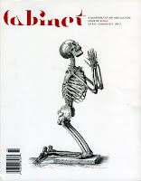
CABINET


Image result for cabinet magazine Image result for cabinet magazine 

The first magazine that we looked at is Cabinet. Here is some info about them:

'Immaterial Incorporated (aka Cabinet) is a non-profit 501(c)(3) art and culture organization founded in 1999. By operating with the most expansive and inclusive definition of “culture” possible, one that includes both the quotidian and the extraordinary, Cabinet aims to foster curiosity about the world we have made and inhabit.'

- CABINET Website

I think this quote 'foster curiosity about the world we have made' really relates to some ideas that we had for our publication. We really like the idea of exploration through art, as we all enjoy doing this as a collective. The content of their magazine is very broad and interesting, and I think doing something like this would bring in a wider audience.

NOBROW
Nobrow is another magazine that we are inspired by, as it is heavily focused on the art genre. 

'We have sought to bring new stories to life, as well as to revive well-worn yarns for new generations of people. We have played with concepts, narratives, genres, formats, printing 

methods, production processes and design in ways that have come to redefine the standards of quality in visual publishing the world over.'

- NOBROW Website

Nobrow is more like an art zine/publication than a magazine which I think is really interesting. It helps to get artist's names out there so I think what they're doing is really amazing, especially for the smaller artists, who getting published would create a lot of publicity for them.

FRANKIE


 Frankie is another magazine that we are interested in. It has playful artwork and their demographic seems to be mostly female through their use of character and colour. 

'looking for a magazine that’s as smart, funny, sarcastic, friendly, cute, rude, arty, curious and caring as they are. We cover design, art, photography, fashion, travel, music, craft, interiors and real-life stories – we aim to surprise and delight readers'

- FRANKIE Website


Thursday 23 March 2017

life's a pitch: existing collectives

SQUEEZE ART COLLECTIVE


  • Advertises work together
  • Exhibits together
  • Promotes each artist individually
  • Local art community

ONE FIVE EIGHT


  • Manchester based
  • Range of disciplines including Illustration, DJs, Photography etc.
  • Everything you need on one page
  • Good for events
BREAD COLLECTIVE


  • Lots of different artists
  • Work a lot with the community
  • Work across varied locations
  • Holds different workshops

Looking at all these different collectives has been very interesting because they are all so different. It goes to show that a collective can be anything you want it to be as long as you are a group of creative individuals who work together and support eachother. I myself have always thought of myself as someone who works alone, however, looking at these different collectives and how it can be whatever you want it's changing my mind. I always thought a collective were people who had to work together on every single project but it can just be about having a network of friends who support  you and exhibiting together to create a stronger breadth of work.


Monday 20 March 2017

life's a pitch: what is a collective?

'An artist collective is an initiative that is the result of a group of artists working together, usually under their own management, towards shared aims.'

Artists working within a collective are united by shared ideologies, aesthetics and, or, political beliefs.
In the early modern period, there were roughly two forms of art collective. Those who sought to bring about social change by cultural means like the futurists. They looked towards the future where they envisioned a radically new way of life. Others, like the dada artists, represented the psychological consequences of the loss of a pre-modern existence and reflected that in their art. They spoke for a collective group, in this case those mentally and physically scarred by the First World War.
Today, thanks to social media, art collectives have an extraordinary global reach, giving them the power to bring about change through direct action. Collectives today are about the present and how they can change society in the here and now.
http://www.tate.org.uk/art/art-terms/c/collective
An arts collective is a group of artists, curators and supporters who work together to support and promote the work of every member of the collective. Usually this is through shared workspace and materials, marketing and promotional efforts, advocacy, and collaborative works. Everyone who is part of the collective jointly shares costs, benefits and risks.
WHAT DO I THINK?
I think a collective is where a group of artists come together who have a similar working pattern. They help to support eachother through not only artistic values but friendship. It's a network of friends who help each other through different situations. You can advertise your work together, or even set up an exhibition together, that way because of all the different work working together, it will gain a bigger audience.

Thursday 16 March 2017

SB1: character design references


https://characterdesignreferences.com/visual-library/

I found this amazing website for Character Design! It has lots of references and images that are collected into sections like certain poses or clothing. I think this will be really helpful for me, especially with the Illustration 2 brief that I am doing at the moment which is all about character design.

I think that this website will give me good opportunities to learn more about how certain poses work and help me to gain inspiration for projects that I am stuck on or unsure of what to do.

They also hold a monthly challenge where they will pick a theme or a word and people from all around the world will submit pieces of art relating to this. I think it would be a good opportunity for me to try and submit a piece to this and see what happens, but for now I am too shy and after seeing so many of the amazing entries I feel like my work is not up to scratch!

Friday 10 March 2017

SB1: glen keane

Glen Keane is a famous animator working at Disney. I chose to look at his work because he has been an inspiration of mine for some time now, and I wanted to celebrate his work here on my blog.

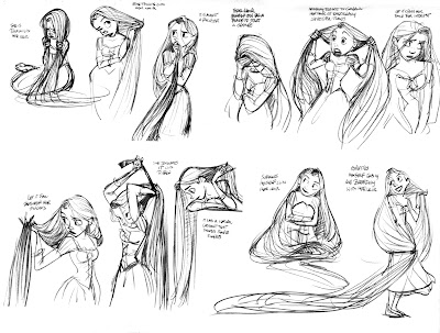
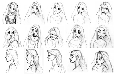
His work that I am most interested in is mostly his character sketches. They are rough but so full of life. It's really inspiring to see how he uses curves and lines and sharp angles to create different personalities for the characters not just in how they look but in how they are posed too.

Image result for glen keane

It's really interesting also to see how he works things out in his sketches. He draws the same thing but in different ways to help with knowing which looks better. This is something I should take into consideration when doing my own work too.

Image result for glen keane

Saturday 4 March 2017

SB1: momolish

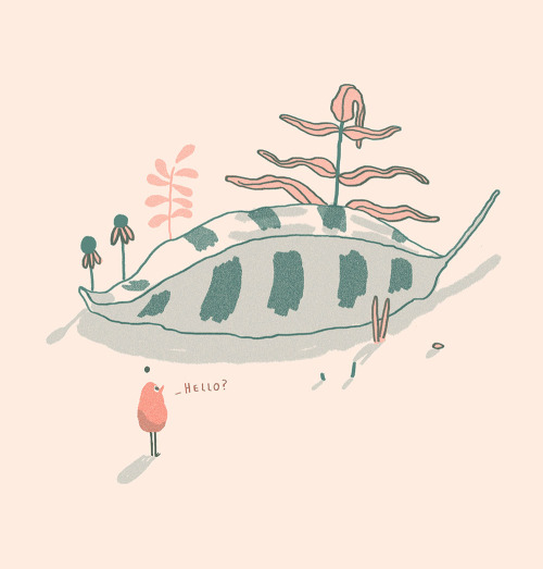
Momolish is someone that I found whilst using Tumblr. Her illustrations are simple, but effectively adorable. She uses complimentary colour schemes and really nice merchandise photography to promote and sell her art.

I decided to feature her on this blog because I have been interested for some time in selling items with my art on. Her aesthetic and cute vibe is something that I think I can relate with as a lot of the time my work gets described as this. I would really like to do shots like this someday of items that I am selling and I think that the photography of your pieces really does matter when selling because it gathers more interest and appeal.


Friday 24 February 2017

creative report: finding more things!


After searching the internet some more I discovered that Helena graduated from Edinburgh in 2015. This wasn't that long ago! I think it'll be really interesting to hear her insight on breaking into the industry and what she thinks.

Monday 20 February 2017

creative report: helena covell

As I have decided to email Helena Covell, I wanted to find out more about her so that I could draft some questions that will be helpful for me and easy enough for her to answer. 

On her website she states:


This is just some basic information about her, and I dont think that it is enough to go on so I was thinking about trying to maybe find some interviews that she has done or other social media she might have such as Tumblr or Instagram.

From her vimeo page, however there is only one animation on there and I think it's quite an old account. It's interesting to see how her work is evolving though, although she's kept a lot of it the same.


Blocks- Chopin Responce from Helena Covell on Vimeo.

This is the video that I found on her vimeo page, it's really interesting to see her take on animation and what she can do with it. Although her art style is quite simple I think the narratives that she creates with her characters is really unique.

Her tumblr also seems to hold not much information. I'm not sure whether this makes it harder for me or easier, as it means that the questions I can ask her can be more broad or open, as she has never really been interviewed before so the answers aren't there for me to find.


I think it will be really interesting to come up with some questions for Helena so that we can find out some more about her and her artwork. As someone who is quite internet mysterious, as in there isn't much information, I think it will be even more interesting for me to find out more.

Thursday 16 February 2017

creative report: deciding my practitioner

I have decided that the person I want to contact as part of this brief is helena covell. She is an illustrator who is currently working and living in Yorkshire. I know that the possibility of us meeting up is quite high because she lives so close, however, for someone like me who is very anxious about meeting new people and going to new places, I think it'll be safer for me to email her. I know that this is the easy way out, but it's hard for me to branch out and do new things. I have found her email on her website and will start to conduct some questions that I want to send to her!

Image result for helena covell

Monday 13 February 2017

SB1: nick swift

After discovering Nick Swift from the video that I watched about Character Design, much like when I found Sergio, I wanted to find out more about Nick's actual work and info.

On the PHA website it states:

This week on the Powerhouse Animation blog, we’re going to focus on one of our employees, Nick Swift, and his personal illustration work! We brought Nick onto the team back in early 2014, and he’s added so much to our company from adorable character designs to consistently maverick lunch suggestions.


NAME: Nick Swift
FAVORITE MOVIES: The Iron Giant, Inglourious Basterds, Assassination of Jesse James
FAVORITE CARTOONS: Samurai Jack, Sym-Bionic Titan, Steven Universe
FAVORITE VIDEO GAMES: Team Fortress 2, UNDERTALE, Final Fantasy 7
FAVORITE COMIC: Blacksad
Nick’s influences range from the classic Norman Rockwell to modern character designer Tony Fucile, whose work you would know from The Iron Giant and The Incredibles. Character designers Bruce Timm and Shane Glines, known for their work on Batman: The Animated Series, also played an important role in influencing Nick’s designs and pin-ups. Some of his favorite artists at the moment include Shiyoon Kim, character designer from Big Hero 6, and Kevin Dart, a color keys artist on Steven Universe.
Looking at his gallery below, you can see how his influences come through in his art – the soft gouache-style painting, strong symbolic figures, and beautiful composition and color choices.


I really enjoyed looking at Nick's work. Like it states in the article about him from PHA, he uses a soft gouache style which is really inviting. I really like this style of working and think it would be interesting to try out.