Saturday 31 March 2018

pp: some sketchbook works


me playing around with typography and seeing what works and what doesn't. working on my little butterfly signature which i think i really like.

self portraits - what do i want it to look like?

Thursday 15 March 2018

pp: website

After going through many different looks and trying to figure out how to use Wix, I think i am finally happy with how my website looks. It's not as in depth as I would like, but that's simply because I'm a bit dim when it comes to trying to figure out how to put things in certain places.

Here it is!


I really wanted to keep the colours simple other than for my work, so I just kept the top part more monochrome, using only black and pink for the about section. At first I had multiple pages, for example having my about page in a different link, but I quite like the idea of just keeping it at the bottom.

Wednesday 14 March 2018

pp: trying out different website builders


squarespace was easy enough to use, but OH MAN it is expensive to keep running. i don't have that kind of money to shell out on a website unfortunately, so i think i'll have to pass on this one. although it looks really cool and professional.


I really tried to use wordpress but i didn't know what the heck was going on. for someone who thinks they're pretty okay with computers this website is super confusing. it took me like 30 minutes to even figure out how to get my images on the front page and they still didn't look the way i wanted them to. 


The final website designer that I tried out was wix and I found it a lot easier than the other ones, everything was fitting the way i wanted it. the only thing is i would like to try and work out how to link my work to other pages with little descriptions about the work but i will figure that out later on. for now i'm happy with how it looks.


Tuesday 6 March 2018

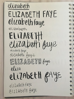
pp: logo/signature testings


trying to play around with ideas for a signature/logo for my brand. i want it to be cute and try to show my brand without any imagery. I think that the 'ef' in the shape of a butterfly is perfect for my practice as I want to specialise in children's illustration, and butterflies are cute, obviously. I think that the letters work really well together and it's quite memorable. 

Sunday 4 March 2018

pp: self-portrait #3


thought i'd go for something a bit different and try out using more colour (i know!). i do quite like how this turned out but there is something about it that is putting me off from using it as my professional portrait. i think i can do better than this. maybe i'm being too hard on myself but i'll see what happens.